Responsive Web Design
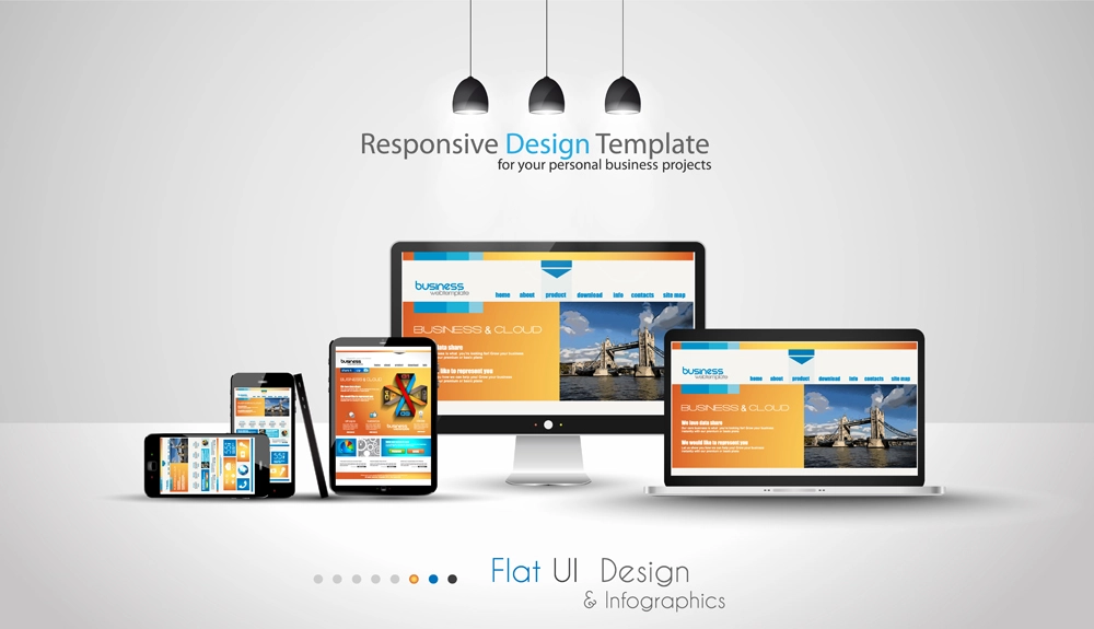
In today’s digital environment, responsive web design is no longer optional—it is an essential
requirement for delivering a positive user experience and improving search engine visibility.
With users accessing websites from smartphones, tablets, laptops, desktops, smart TVs, and even
emerging devices, your website must adapt seamlessly to every screen size and platform.
Taylored Web Solutions builds every website with a 100% responsive, mobile-first design
strategy. This ensures that your pages automatically adjust their layout, images, navigation,
and content structure to provide an optimized viewing experience regardless of device type.
Responsive design improves readability, reduces load times, and creates a more intuitive browsing
experience that keeps visitors engaged.
Search engines such as Google prioritize responsive websites because they deliver consistent performance
across all devices. A fully responsive website supports stronger SEO results, increases visibility in
local and organic search listings, and improves your SEM performance by aligning with modern ranking
signals and user behavior patterns.
A site that functions flawlessly across iPhone and Android devices, Windows and Mac desktops, Chrome,
Safari, Firefox, and Edge ensures that no user is excluded. This universal accessibility strengthens your
digital brand, enhances credibility, and encourages repeat visitors. In a competitive market, businesses
that embrace responsive design stand out with a smooth, professional, and reliable online presence.
By choosing Taylored Web Solutions, you ensure that your site will look sharp, load fast, and perform
correctly across all platforms—even as new devices enter the marketplace. Responsiveness is more than
a feature; it is a long-term investment in user satisfaction, search ranking, and the overall
effectiveness of your digital strategy.